Logo Review Guide
How to Test a Logo on an App Store Listing
Learn how to test an app logo on an App Store listing for small-size clarity, screenshot hierarchy, contrast, and brand recognition before you publish.
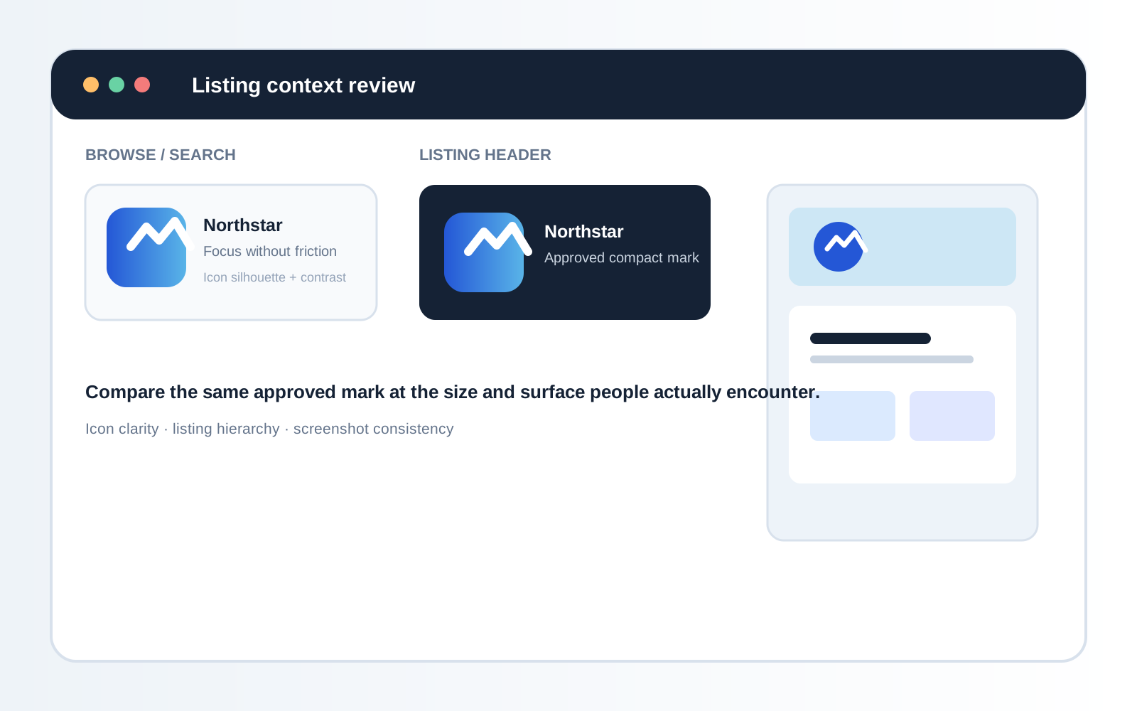
An app logo has to do more than look polished in a brand folder. On an App Store listing, it may appear as a small icon beside competing apps, inside a screenshot, in promotional artwork, or next to a product name that does most of the explaining. A mark that reads clearly on a large artboard can lose its shape at icon size, blend into a screenshot, or become hard to recognize when the listing is viewed quickly.
This guide reviews an existing logo in its actual app-store context. It identifies visual and consistency issues; it does not predict downloads, rankings, or guaranteed audience response. Apple’s App Store Connect Help documentation remains the source of truth for current screenshot dimensions and submission rules.
Start with the complete listing
Review the surfaces, not only the logo file
Gather the app icon in search and category views, the app name and subtitle, the first screenshot and its headline, the complete screenshot sequence, promotional artwork, and light or dark device appearances where relevant. Keep the source logo, icon artwork, screenshots, and store metadata in one review folder. Record platform, device class, display scale, and listing version so every observation has a reproducible condition.
For a shared vocabulary covering clarity, contrast, scalability, and application fit, use the Logo Evaluation Criteria. The app-store review below applies that framework to a compressed digital context.
1. Test the app icon at the size people see
Start with the icon in the listing, not a large version in a design tool. Reduce the surrounding page until the icon competes with nearby results. Look for a recognizable silhouette, open counters and gaps, stable internal spacing, a clear relationship between symbol and background, and an intentional decision about whether wordmark text belongs there.
Do not assume the full logo lockup belongs inside the icon. Use an approved symbol or compact treatment when the identity system defines one; do not crop the master logo informally. Also inspect source bounds and export quality. Transparent padding can make a visible symbol look small, while a blurry raster export can make a clear identity appear weak.
2. Review contrast against the icon background
Review the intended colorway against the actual icon background and beside realistic neighboring content. Ask whether the mark separates at a glance, whether internal gaps remain visible, whether a gradient or texture competes with it, and whether the icon keeps a stable visual center. Test approved colorways or a simpler background before adding an outline, glow, or shadow that may change the identity.
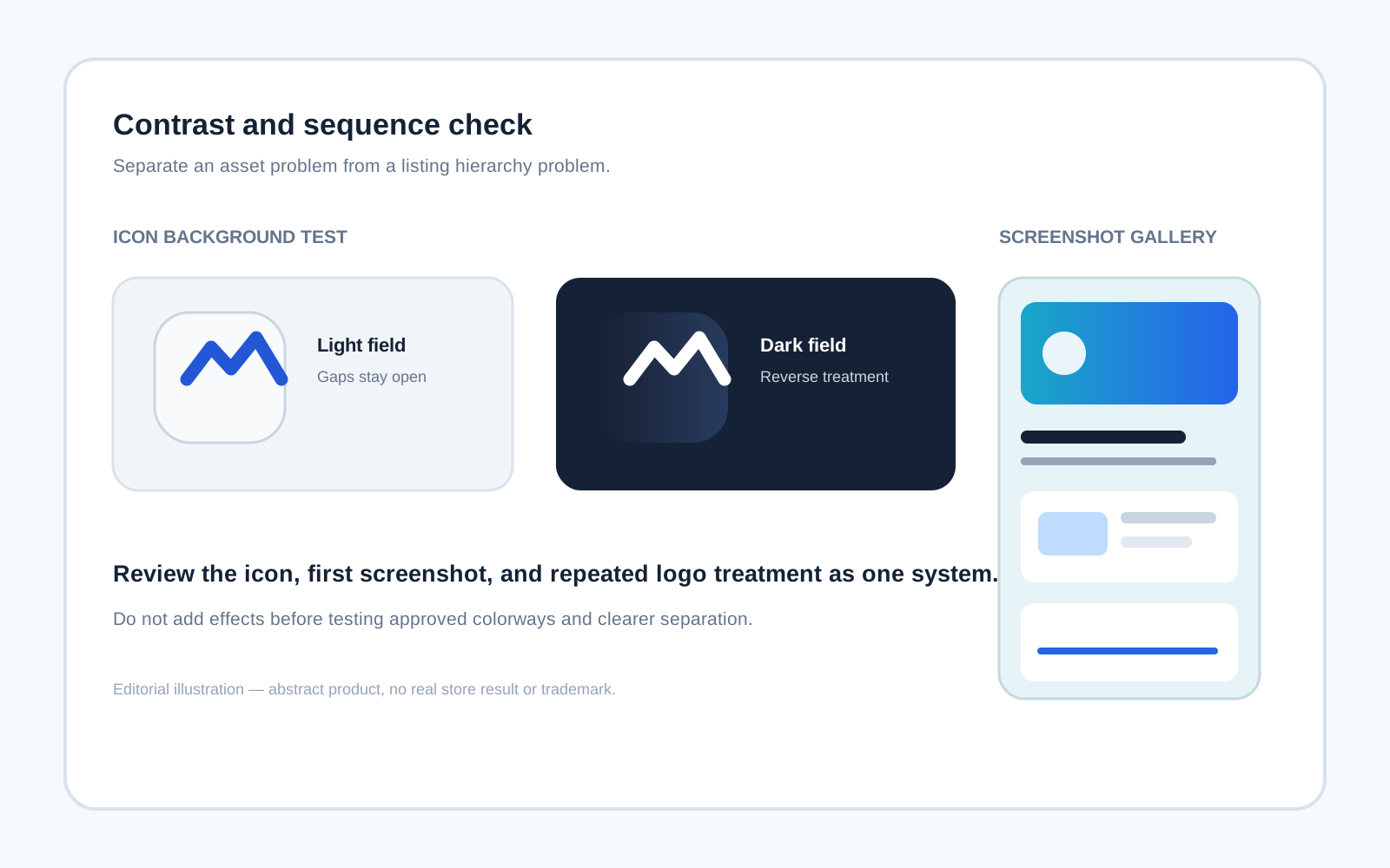
3. Check screenshot hierarchy and logo consistency
Screenshots contain product UI, feature headlines, illustrations, and calls to action. The logo should support recognition without taking attention away from the evidence. Check whether repeated placement is intentional, headlines remain readable, the mark avoids busy imagery, and icon, app name, screenshots, and in-product treatment feel like one identity system.
Compare the icon, screenshot wordmark, loading screen, and marketing art side by side. A listing can feel inconsistent even when every individual asset looks acceptable. Classify each difference as an approved variant, a background decision, or an accidental export before recommending a change.
4. Test recognition without relying on the app name
Temporarily cover or blur the app name and ask what remains: silhouette, color relationship, and repeated visual cues. Use a small comparison set from the actual listing and nearby category references at the same approximate size. Record qualitative observations such as “the mark loses its center at small size”; do not invent recognition scores or present this as customer research.
Then reverse the test by hiding the icon and inspecting screenshots and name. The goal is to understand which element carries recognition on each surface so the team can make an intentional decision. Distinctiveness is not unusualness: a detail that disappears at small size does not help.
5. Compare search, listing, and screenshot contexts
In search or browse view, check outer silhouette, contrast, and separation from neighboring icons. In the listing header, check the relationship between icon, app name, metadata, and controls. In the screenshot gallery, check the first screenshot especially carefully, then scan the full sequence for consistent spacing, color, and approved variants.
For an illustrative example, a productivity app might have a crisp blue icon but use a dark-purple wordmark over a busy first screenshot and a white mark in inconsistent corners. That is a colorway, placement, and naming consistency problem—not evidence that the icon itself has failed. For another digital context, see reviewing a logo in a website header.
A practical app-store logo checklist
- The icon uses the current approved asset or documented compact treatment.
- The visible mark remains clear at realistic browse and listing sizes.
- Source bounds and export quality do not make it unexpectedly small or soft.
- The mark separates from its background without an unapproved effect.
- Icon, app name, screenshots, and in-product treatments form one identity system.
- The first screenshot balances product evidence, headline, and logo.
- Search, listing-header, and screenshot contexts are each reviewed.
- Findings record surface, asset, background, size condition, and next step.
The Logo Review Tool can organize a structured first pass across clarity, contrast, accessibility, scalability, uniqueness, versatility, and application fit. Related reading: Logo Evaluation Criteria Explained, How to Test a Logo Before Launch, and How to Know If Your Logo Is Good.
App Store listing logo test FAQ
Should the full logo be used as an app icon?
Not necessarily. Many identity systems use an approved symbol or compact treatment for small digital surfaces and the full lockup beside the app name or in marketing assets. Use only a documented or approved variant; do not crop or simplify the master logo informally.
How can I tell whether an app icon is too detailed?
View it at a realistic store size and check whether its silhouette, internal gaps, and primary shape remain distinguishable. If details disappear or merge, compare an approved simpler treatment or adjust the icon artwork with the identity owner.
Should the logo appear in every App Store screenshot?
No. Repetition is useful only when it supports a consistent listing hierarchy. Include the logo where it helps identify the product or creates an intentional system, but do not let repeated marks crowd the product interface or screenshot headline.
Can an App Store logo test prove that people will recognize my app?
No. A visual review can identify clarity, contrast, consistency, and context issues. It is not customer research and cannot establish recognition, preference, downloads, rankings, or conversion performance.
What should I record when a logo fails in a store listing?
Record the platform and surface, approximate display size, icon or screenshot asset, background, neighboring content, visible failure, and the next proposed test. Classify the issue as an asset, identity-system, layout, export, or platform-rendering problem.
A reliable listing review is not about making a logo larger by default. It is about matching the approved mark to the real store surfaces, testing it across sizes and contexts, and recording a focused decision that designers and product teams can implement consistently.