Logo Review Guide
How to Review a Logo in a Website Header
Learn how to review an existing logo in a website header for scale, contrast, hierarchy, responsive layouts, and interaction states before you change the design.
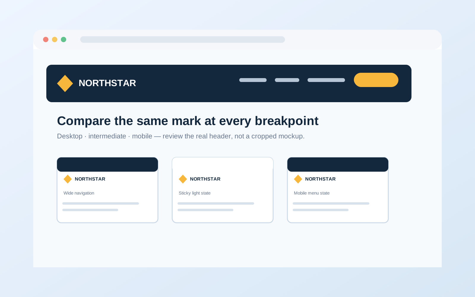
A logo can look balanced on a presentation slide and still create problems in a website header. It may become too small beside navigation, lose contrast on a sticky bar, compete with a call to action, or disappear when the mobile layout switches to a menu button. Reviewing the logo in its actual header context helps separate an identity problem from a layout or implementation problem.
This guide is for teams that already have a logo and need to decide whether it works in a website header. The goal is not to redesign the mark because one screenshot feels crowded. Review how the approved logo behaves at the sizes, backgrounds, breakpoints, and interaction states visitors actually encounter. A browser preview is useful evidence, but it is not a complete accessibility audit or guarantee that every device renders identically.
Start with the header conditions
Record the context before judging the mark
Before judging the logo, record the header height and available space on desktop, tablet, and mobile; the lockup being used; navigation length; primary actions; search, account, or language controls; and whether the header is static, sticky, shrinking, overlayed, or transparent over a hero image.
Also note light, dark, branded, image-based, and elevated backgrounds, plus hover, focus, active, open-menu, loading, and signed-in states. Ask for the real route or a representative build rather than reviewing only a cropped design mockup: the live header reveals wrapping, overflow, focus indicators, sticky behavior, and route differences. For a shared vocabulary, use the Logo Evaluation Criteria.
1. Check the logo at its displayed size
Start at the size visitors see, not at 400% zoom and not inside the original vector file. Review the full lockup and any approved compact treatment in the desktop and mobile header. Look for wordmark letters that become difficult to distinguish, thin strokes or counters that close, a symbol that loses its silhouette, excess whitespace inside the asset, or a lockup whose parts no longer feel proportionate.
Do not judge size by a universal pixel rule. The right display size depends on detail, wordmark, clear space, header height, viewing distance, and surrounding elements. A compact mark may be appropriate on mobile only when it is an approved part of the identity system. Inspect asset bounds before concluding the identity needs to be enlarged.
2. Review hierarchy against navigation and actions
A header has limited visual attention. The logo identifies the site or product, navigation helps visitors move, and the primary action gives them a next step. Ask whether a visitor can find the brand mark quickly, whether it has separation from the first navigation item, whether the action stays prominent, and whether the row remains balanced when labels or account states change length.
A crowded header is not automatically evidence that the logo is wrong. The cause may be too many navigation items, generous control padding, an oversized action button, a long brand name, or a container that does not adapt. Test those relationships before changing artwork; identify the smallest change that restores clear hierarchy.
3. Test contrast in every header background
Review the default light header, dark or reversed header, transparent header over representative hero imagery, sticky or scrolled header, open mobile-menu background, and hover/focus states around nearby controls. Inspect the wordmark, internal gaps, and small accompanying text—not only the outside edge.
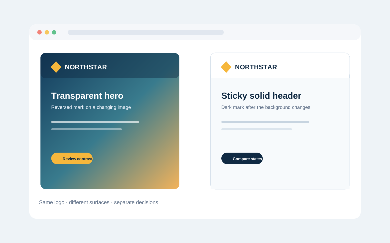
Do not add a drop shadow, glow, or arbitrary outline as a universal fix. First test an approved colorway, a solid header surface, sufficient separation, or a documented responsive treatment. For navigation and controls, use applicable WCAG guidance; a logo treatment does not replace an accessibility review.
4. Compare responsive breakpoints, not device labels
“Desktop” and “mobile” are too broad. Resize gradually and note when the wordmark, navigation, or action becomes crowded; whether the logo changes to an approved compact or stacked version; whether header height changes without clipping; and whether navigation wraps, overflows, or disappears unexpectedly.
Capture the exact condition rather than writing “mobile looks bad.” Record the approximate viewport range, logo treatment, competing element, background, and visible failure. Browser zoom, larger text, font loading, localization, and content length can expose a collision earlier, so avoid treating one device screenshot as proof of universal behavior.
5. Inspect interaction and scroll states
Check the default header before scrolling, sticky header after scrolling, hover or focus on nearby controls, open navigation, active navigation, loading or route-transition state, and signed-in or expanded account state where relevant. Confirm that borders, shadows, announcement bars, or sticky states do not shift the logo unexpectedly.
Ensure an interactive logo link has a visible focus treatment and an accessible name supplied by the implementation. If the header overlays content, inspect the logo against what sits behind it and verify the first meaningful section is not obscured. Review color transitions and resting states separately.
6. Separate logo issues from header issues
Use a short diagnosis before recommending a change:
- Asset issue: excess whitespace, wrong colorway, blurry raster source, or unapproved export.
- Identity-system issue: no workable compact, reversed, or one-color treatment for a documented condition.
- Layout issue: spacing, container width, navigation length, control size, or alignment creates the collision.
- Implementation issue: the asset fails to load, gets clipped, lacks focus behavior, or switches at the wrong time.
- Content issue: long navigation labels, localization, or account states change available space.
For example, a reversed wordmark may work over a dark hero and disappear when a sticky header becomes white. Confirm whether an approved dark wordmark exists and test the exact scroll state before redesigning the logo. For another context-based review, see the SaaS startup logo review example; it is illustrative, not evidence of a client result.
A practical website header logo checklist
- The current approved logo and colorway are used.
- Displayed desktop, intermediate, and mobile sizes preserve legibility.
- Asset bounds do not add unexpected whitespace.
- Light, dark, transparent, sticky, and menu backgrounds are reviewed.
- Breakpoint transitions and default, scroll, hover, focus, active, and open-menu states are checked.
- Browser zoom, larger text, longer labels, and localization are considered where relevant.
- Each issue is classified as asset, identity-system, layout, implementation, or content.
The Logo Review Tool can organize a first review across visual clarity, contrast, scalability, versatility, and application fit. Treat it as a structured aid—not a replacement for checking the live header or validating accessibility. Related reading: Logo Evaluation Criteria Explained, How to Test a Logo Before Launch, How to Know If Your Logo Is Good, and Why Your Logo Is Hard to Read.
Website header logo review FAQ
How large should a logo be in a website header?
There is no universal header size that works for every logo or layout. Choose a display size that preserves the mark’s legibility and hierarchy within the available header height, clear space, navigation, and controls. Test the actual rendered logo at each relevant breakpoint instead of copying a pixel value from another site.
Should a website use a different logo on mobile?
It can, if the identity system includes an approved compact, stacked, or icon-only treatment for that context. Cropping a wordmark or hiding part of the logo informally can weaken recognition and create inconsistent use. Document the selected variant and its background and size rules.
Why does my logo look fine on the homepage but fail after scrolling?
The header may change from transparent to solid, or the background and logo color may not switch together. Compare the logo treatment, header surface, and surrounding navigation in both states. The fix may be an approved colorway or documented sticky-header treatment rather than a redesign.
Can a logo review prove that a website header is accessible?
No. A logo review can identify contrast, scale, focus, and hierarchy concerns, but accessibility also depends on navigation semantics, keyboard behavior, text, controls, motion, and assistive-technology support. Use the review as one input and test the implemented header against applicable requirements.
What should I record when a logo fails at a responsive breakpoint?
Record the route, approximate viewport condition, logo variant, background, header state, competing element, and exact failure. Include a screenshot or recording and classify the issue as an asset, identity-system, layout, implementation, or content problem.
A reliable header review is not about making a logo larger by default. It is about matching the approved mark to the real interface, testing it across states and sizes, and recording a focused decision that designers and developers can implement consistently.